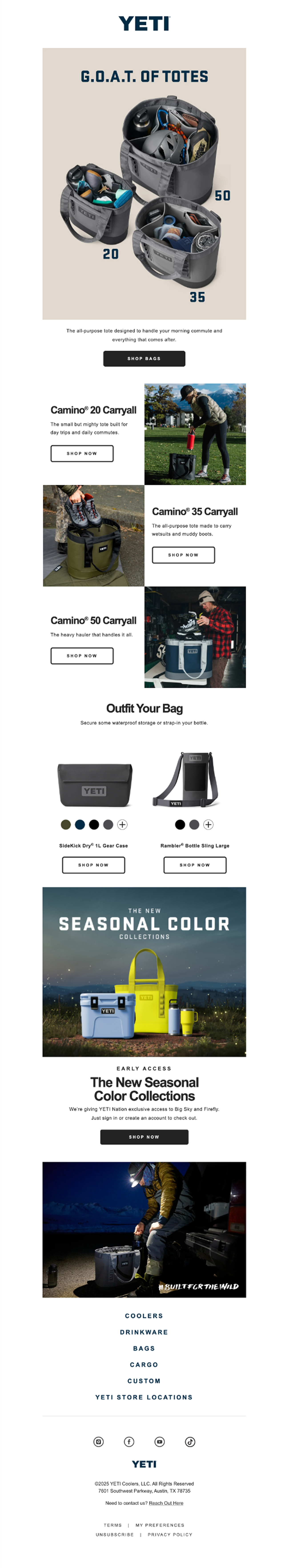
The goal of this project was to take a real marketing email from YETI and reimagine it as a cleaner, more effective customer experience. Their original send had strong photography and brand energy, but the layout felt scattered and the main message—the tote collection—got lost among competing sections. I wanted to demonstrate what a more intentional, conversion-driven version could look like.
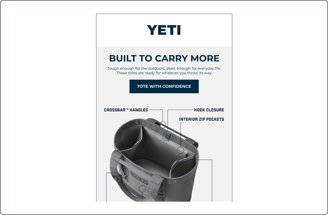
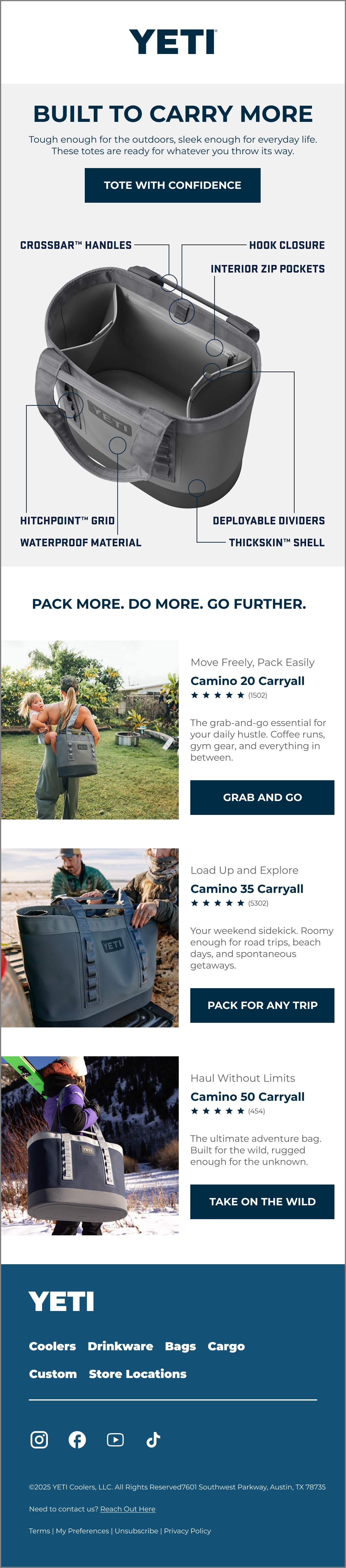
My redesign starts with a strong hero section that clearly introduces the product and its value. The original email opened with imagery but didn’t set direction or context. I added a simple headline, subhead, and CTA to anchor the message and guide the reader. From there, I pulled out the tote’s most important features and added a labeled “feature callout” image, giving readers a quick snapshot of what makes the product stand out without scrolling through multiple modules.
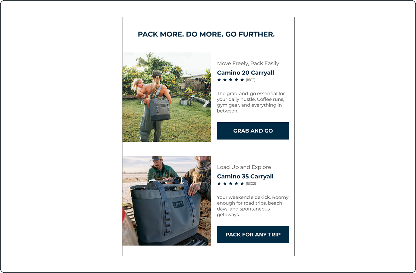
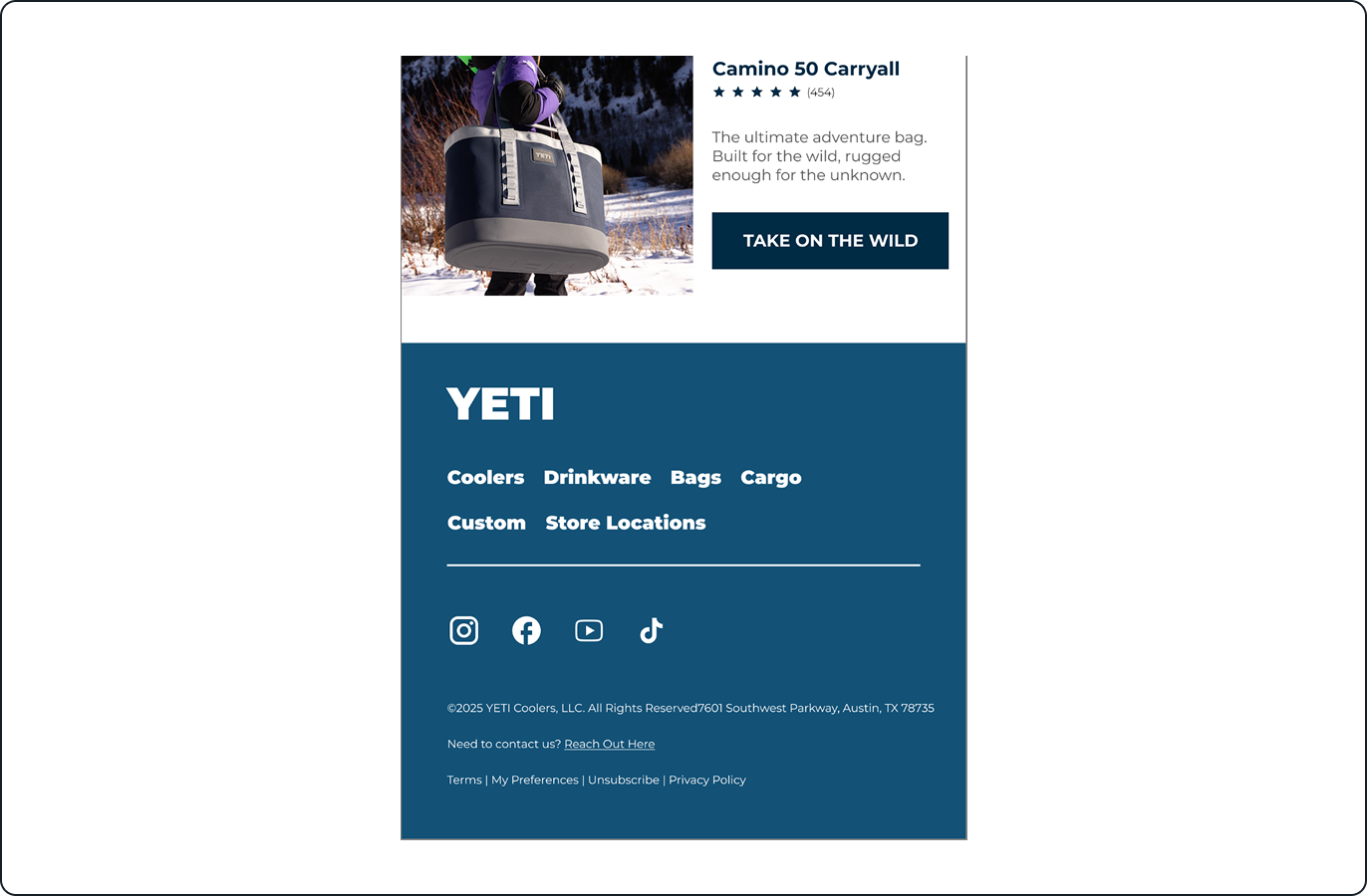
I also restructured the product lineup to create a clear flow: Camino 20 → Camino 35 → Camino 50. Each item includes a concise headline, benefit-driven copy, and an action-oriented CTA (“Grab and Go,” “Pack for Any Trip,” “Take On the Wild”). This makes the email easier to skim while giving customers meaningful reasons to click.
To wrap it up, I refreshed the footer to feel more modern and aligned with YETI’s aesthetic. I streamlined the categories, improved spacing, and made all links more mobile-friendly. The entire redesign was rebuilt in MJML to ensure clean, responsive, and cross-client-reliable code.
This project highlights my ability to refine hierarchy, simplify complex layouts, and produce polished, production-ready emails from both a design and technical standpoint.